How the 4 C.R.A.P. Design Principles enhance User Experience
April 14, 2023
When you see a design, you naturally can tell if it's appealing or not, but what specific factors determine a good design?
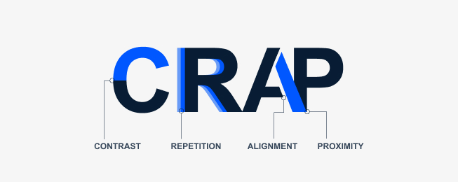
As you explore the world of graphic design, you'll inevitably come across a set of design principles known as C.R.A.P., an acronym that stands for Contrast, Repetition, Alignment, and Proximity.
The C.R.A.P. design principles were introduced by Robin Patricia Williams in her book The Non-Designer's Design Book and have since become a staple in the field of visual communication.
Understanding and applying these principles can significantly enhance the user experience, making your design more effective, visually appealing, and easy to navigate.
In this blog post, we will dive deep into the C.R.A.P. design principles, exploring each component and how they contribute to creating a design that captures attention, establishes hierarchy, and simplifies communication.
The Four C.R.A.P. Design Principles Explained
Contrast
Contrast is the backbone of any design. By differentiating elements in your design through color, size, font, and other visual properties, you create focal points that guide the user's eyes and help them make sense of the content. The principle of contrast is essential for several reasons:
It attracts attention: A design with strong contrast will draw the viewer's eye, making it more likely they'll engage with the content.
It establishes hierarchy: By using contrast effectively, you can create a visual hierarchy that helps users understand the order of importance of different elements within your design.
It enhances readability: Contrast between text and background color improves legibility, ensuring that users can easily read and comprehend your content.
To implement contrast effectively, consider the following tips:
Use contrasting colors: Choose colors that complement each other and stand out against one another. You can use color theory and tools like the Adobe Color Wheel to help you find the right color combinations.
Vary font size and weight: Use different font sizes and weights to create emphasis and hierarchy within your design. For example, headers should be larger and bolder than body text.
Employ contrasting shapes and patterns: Combine different shapes and patterns to make certain elements stand out from the rest.

Repetition
Repetition is the intentional use of recurring elements throughout your design to create consistency, unity, and a sense of cohesiveness. It helps users build familiarity with your design and reinforces your brand identity. Repetition can be applied to various design elements, including colors, fonts, shapes, and patterns.
By incorporating repetition into your design, you achieve the following benefits:
Improved consistency: Repeating elements create a consistent look and feel across your design, making it easier for users to navigate and understand the content.
Reinforced branding: Repetition of brand elements, such as logos, colors, and fonts, strengthens your brand identity and makes it more memorable.
Enhanced visual appeal: Consistent use of design elements can make your design more aesthetically pleasing and professional-looking.
To incorporate repetition effectively, consider these tips:
Use a limited color palette: Choose a color scheme and stick to it throughout your design to create a sense of unity.
Maintain consistent typography: Use the same font family for all text elements and apply different font sizes and weights to establish hierarchy.
Repeat shapes and patterns: Use the same shapes and patterns across your design to create a cohesive visual language.

Alignment
Alignment refers to the arrangement of elements in your design so that they line up in a visually organized and logical manner. Proper alignment helps users follow the flow of information, creating a clean and structured look that is easy to navigate. Alignment is essential for several reasons:
It creates a sense of order: Aligning elements in your design helps users process the information more efficiently and reduces visual clutter.
It strengthens hierarchy: Aligning related elements can help emphasize their relationship and importance within the design.
It enhances professionalism: A well-aligned design appears more polished and professional, which can increase trust in your brand or message.
To implement alignment effectively, consider the following tips:
Use a grid system: Grid systems help you arrange elements in a consistent and organized manner, making it easier to maintain alignment throughout your design.
Align related elements: Group related elements and align them to emphasize their relationship and create a logical flow of information.
Be consistent with alignment styles: Choose one alignment style (left, right, centered, or justified) for each group of related elements and maintain that style throughout your design.

Proximity
Proximity refers to the strategic placement of elements in your design to show their relationship and create a sense of organization. By grouping related elements together and separating unrelated elements, you make it easier for users to understand the structure of your design and find the information they need. The principle of proximity is essential for several reasons:
It simplifies communication: Grouping related elements together makes it easier for users to understand the purpose and message of your design.
It reduces clutter: By placing unrelated elements farther apart, you reduce visual clutter and make your design easier to navigate.
It reinforces hierarchy: Proximity helps establish the hierarchy of information in your design, making it easier for users to identify key points and follow the flow of information.
To implement proximity effectively, consider these tips:
Group related elements: Place elements that share a common function or purpose close together to create a sense of unity and organization.
Use whitespace strategically: Leverage whitespace to separate unrelated elements and create breathing room in your design, making it easier for users to process the information.
Avoid overcrowding: Ensure there is enough space between elements to avoid a cluttered appearance and maintain visual clarity.

Conclusion
The C.R.A.P. design principles - Contrast, Repetition, Alignment, and Proximity - are essential tools for creating visually appealing, effective, and user-friendly designs. By understanding and applying these principles, you can elevate your designs, enhance user experience, and ultimately achieve your communication goals.
Remember that mastering these principles takes time and practice, so keep experimenting and refining your design skills to create captivating and memorable experiences for your users.