How to achieve Visual Clarity
May 07, 2022

Since the Internet was made available to the general public in the late 90s, users' expectations of what the web experience should feel like have changed dramatically. Those who have not managed to adapt their digital experiences to these new expectations have been naturally pushed aside.
An important but often neglected aspect of this digital evolutionary path is the visual clarity in modern web design. Having a clear design that is not visually complex prevents information overload for the users. This ultimately leads to the following effects:
- Improved readability and eye focus
- Better usability and UX
- Improved conversion rate and ROI
- Decreased bounce rate
- More Trust
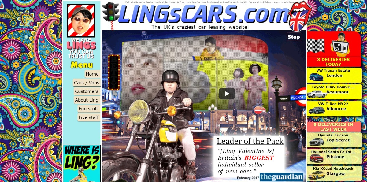
An extreme example of this is the comparison of the Apple website with that of Ling's Cars.
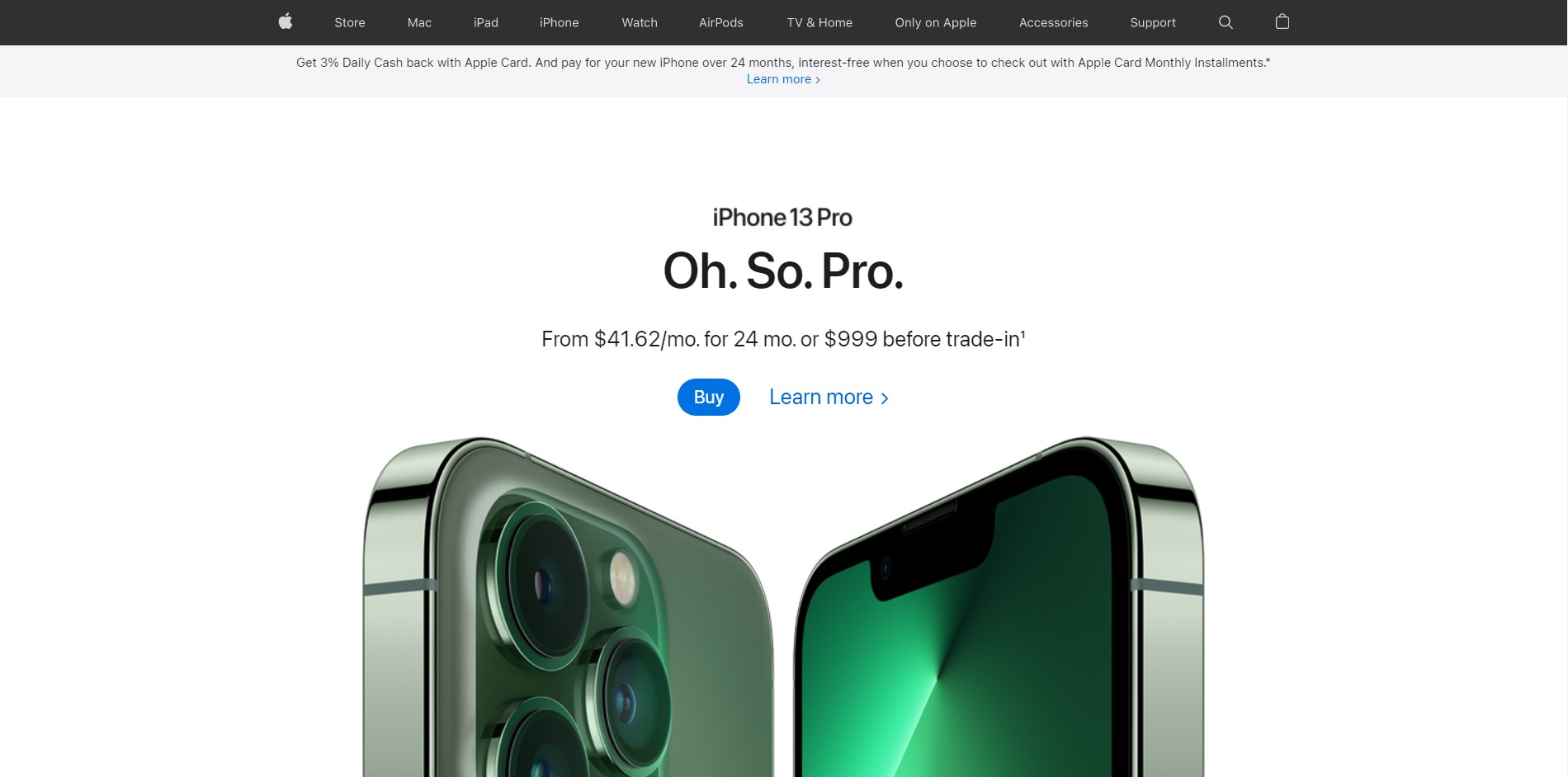
In the case of Apple, we have a balanced design. We can quickly see what product it is and what steps we need to take if we want to buy it.
At Ling's Cars, on the other hand, we have a lot of flashy and contrasting colors that cause distraction. Furthermore, the website contains many different elements that crave for attention. This ultimately leads to a cluttered overall picture, users get confused and bounce.
The clarity score tells you how clear and clean your design is. Obviously, your design should not have too many elements or a lot of clashing colors. The higher the score, the cleaner your design. A low score suggests your design might be cluttered and the message you are trying to send, is lost.
Can visual clarity be measured?
A crucial prerequisite for improvement and optimization of any kind is to have a proper metric. Otherwise, we rely too heavily on subjective assessments.
When you upload a design to the Clueify platform, you are automatically provided with a Clarity Score between 0 and 100.
The Artificial Intelligence algorithm takes into account all aspects of the design and rates its visual clarity. The most important factors are the amount of text, text size, contrast, color, number of elements and their size.
Which Clarity Score is desirable?
In order to be able to make a targeted evaluation of the Clarity Score we have specified the following 4 ranges:
- Severe difficulty (0 - 40)
- Moderate difficulty (40 - 67)
- Optimal Clarity (67 - 90)
- Too simple (90 - 100)
Ideally, a design should achieve a high Clarity Score between 67 - 90. A Clarity Score higher than 80 indicates an extremely plain design and relevant information may not be available to the user. This should also be avoided.
In some industries, however, even moderate difficulty may be acceptable. For example, in e-commerce stores, it is difficult to reduce the number of elements. And also for news & media sites, the images inevitably mean that there are many different colors.
That is why we have also developed a benchmark for the individual industries. Simply select the category to which the design belongs and draw a comparison with potential competitors. The benchmark is based on the 10,000 most visited websites in the respective sector.
How can visual clarity be improved?
When confronted with a visually complex design, the following steps have proven to be effective:
- Increasing whitespace
- Sticking to a simple color palette
- Reducing borders and lines to a minimum
- Collapsing or removing detailed information
The modifications don't have to be perfect the first time, because de-cluttering is an iterative process.
For example, let's take a closer look at the old website of the large German online furniture store Home24. The design has a clarity score of 58 and can therefore be classified as moderate difficult.
Even though eCommerce stores tend to be in the midfield in terms of visual clarity due to the variety of items that need to be presented, there is room for improvement.

First of all, we could make the header menu a little brighter, so that it doesn't contrast too much with the rest of the page.
In addition, instead of text for the customer account and customer service elements, appropriate icons could be used and semantically brought on one level with the shopping cart. This allows us to completely remove one row in the header and thus create more whitespace.
Also, the overall information can be reduced a bit to draw more focus on the key messages. The subtitles of the individual product categories at the bottom are not mandatory. And the vertical customer service button on the right side should ideally only appear when scrolling down since this functionality is already present in the header.
After reanalyzing with Clueify, we can see that our adjustments improved the visual clarity to a value of 64 (+6).

The current landing page of Home24 even goes one step further. Here, a less high hero image was chosen, which in turn allows more padding to the product categories.
In addition, the border has been removed from the product category cards. This creates a more open and balanced overall picture. The Clarity Score is now 68 and the design is in the "Optimal Clarity" range.

Conclusion
The Clarity Score helps you design clearer and more compelling web experiences.
Visual clutter should be avoided at all costs. Nevertheless, the design should not get too simple and still provide the considered value for the end user.